From sage to celery, here are 10+ designer-approved ways to decorate with green
-
 Loading...
 - Binita Ahuja
- 10 Jun 2022
- 262 Views
- 0 Like
- 0 Comment
Green has become the color du jour in recent years, popping up in kitchens and living rooms in various hues from emerald and acid. Much of this resurgence has to do with its natural qualities, evoking evergreen forests, verdant gardens, and paradisal palms. In 2020, when we were all sequestered due to shelter-in-place mandates, these bring-the-outdoors-in colors were more popular than ever.
The hue has a long history. But it wasn’t always something you wanted in your house—in 1775, an emerald color known as Scheele’s Green was all the rage. The catch? This beloved pigment was made with arsenic; one laced wallpaper was rumored to have caused the death of Napoleon Bonaparte. Nowadays, of course, green is completely safe to use in paints, wallpapers, curtains, and furnishings. So what pairs best with this natural tone? We polled interior designers on their favorite ways to incorporate green in their projects, from statement-making dining rooms to serene offices.
1
BRIGHT WHITES

“Green is truly my favorite color… it relaxes me, enlivens me, and inspires me. I actually pulled two greens for my most-used room, my kitchen—a brighter, almost light teal green and a darker, hunter green. The bright white of my main cabinetry is the perfect companion; whites in all shades always enhance the power of green, giving it the perfect pop and making the most impactful rooms.” —Martyn Lawrence Bullard
2
MORE GREEN!

“I’m convinced that you can’t go wrong with green. Its myriad hues have merit individually and rather magically seem to find ways of complementing one another when used together. In this room I intentionally clashed the greens as a way of crafting an earthly palette that wasn’t somber. Much consideration was given to the various sheen levels, which play off one another rather well. I cannot recommend green highly enough for trims, casings, and skirtings, be they contemporary or traditional, and my favorite white paint is Benjamin Moore’s Moonshine, which takes on a captivating greenish glow.” —Colette van den Thillart, Colette van den Thillart Interior Design
3
PINK AND YELLOW

“Generally, if you look to nature, green pairs beautifully with everything. The palette of this space takes a lot of inspiration from the pink and yellow blooms of the trumpet trees found throughout Los Angeles. For the lacquered green architectural ‘box’ we designed for this project, we used a glossier finish. Since green is so often associated with nature, it was interesting to do something more counterintuitive and unexpected." —Rachel Bullock, LAUN
4
PINKS, YELLOWS, AND BLUES

“Green, especially in earthy iterations, can work as a neutral and be used to temper brighter colors like pinks, yellows, or shades of blue. It works well in this bathroom because it allows the other colors to sing while also connecting those more vivid hues in the wallcovering. I wanted it to feel appropriate to the historic house while bringing in a modernity—which is introduced through the scale of the pattern—to keep the space from becoming too sweet or precious.” —Heidi Caillier, Heidi Caillier Design
5
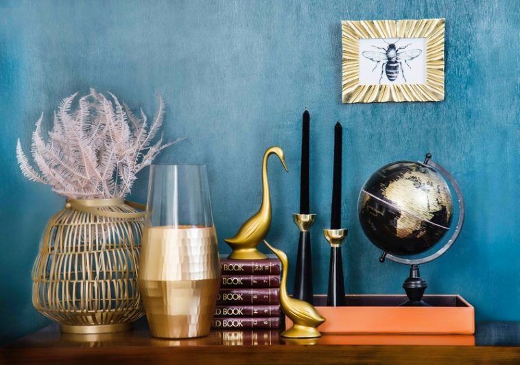
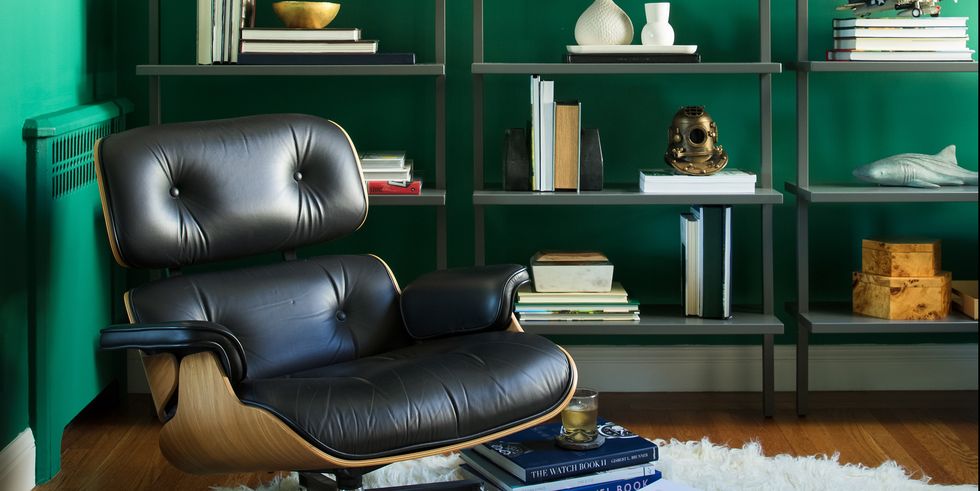
NAVY AND BRASS

“Green and blue are a natural pair, with navy being an especially versatile partner with all shades of green. Glossy, golden brass finishes are a great compliment as well, partnering nicely with the cool undertones found in greens. In this library, we played off the luxurious rich green hue by juxtaposing it with playful accessories and a retro shag rug. This balance creates a room that is both sophisticated and fun, our favorite combination.” —Emilie Munroe, Studio Munroe. Read More...