How to use Colour Schemes in Art
-
 Loading...
 - Lucas Wilson
- 06 Jun 2022
- 269 Views
- 0 Like
- 0 Comment
Designers plan the colour schemes they want to use before they start designing, to create consistency, evoke emotions from the onlooker, or to showcase their signature style. Fine artists can use colours schemes in their work too—a well thought through palette can take a painting from looking good, to spectacular.
If you don’t paint realistically by matching colours from a reference, it can be useful to select and plan colours before you pick up your paint brush. This way you can control the outcome of the piece and to an extent, the effect it will have on the viewer. Even if you do paint realistically, you can subvert norms and create a more painterly look by choosing a more surreal but harmonious colour scheme.
This is an interesting approach to creating an artwork—most artists won’t fore plan a colour scheme before they start painting. However, you can create a pleasing effect by choosing colours that harmonise, or try and hold the onlooker’s attention by using complementary colours.
Using colour in this way, you can create a piece that is completely unique and evocative of a mood you are trying to portray. By understanding the different colour schemes, it can help you to be much more intentional when mixing and combining colours in your artworks and aware of the effect your work might be having on people.
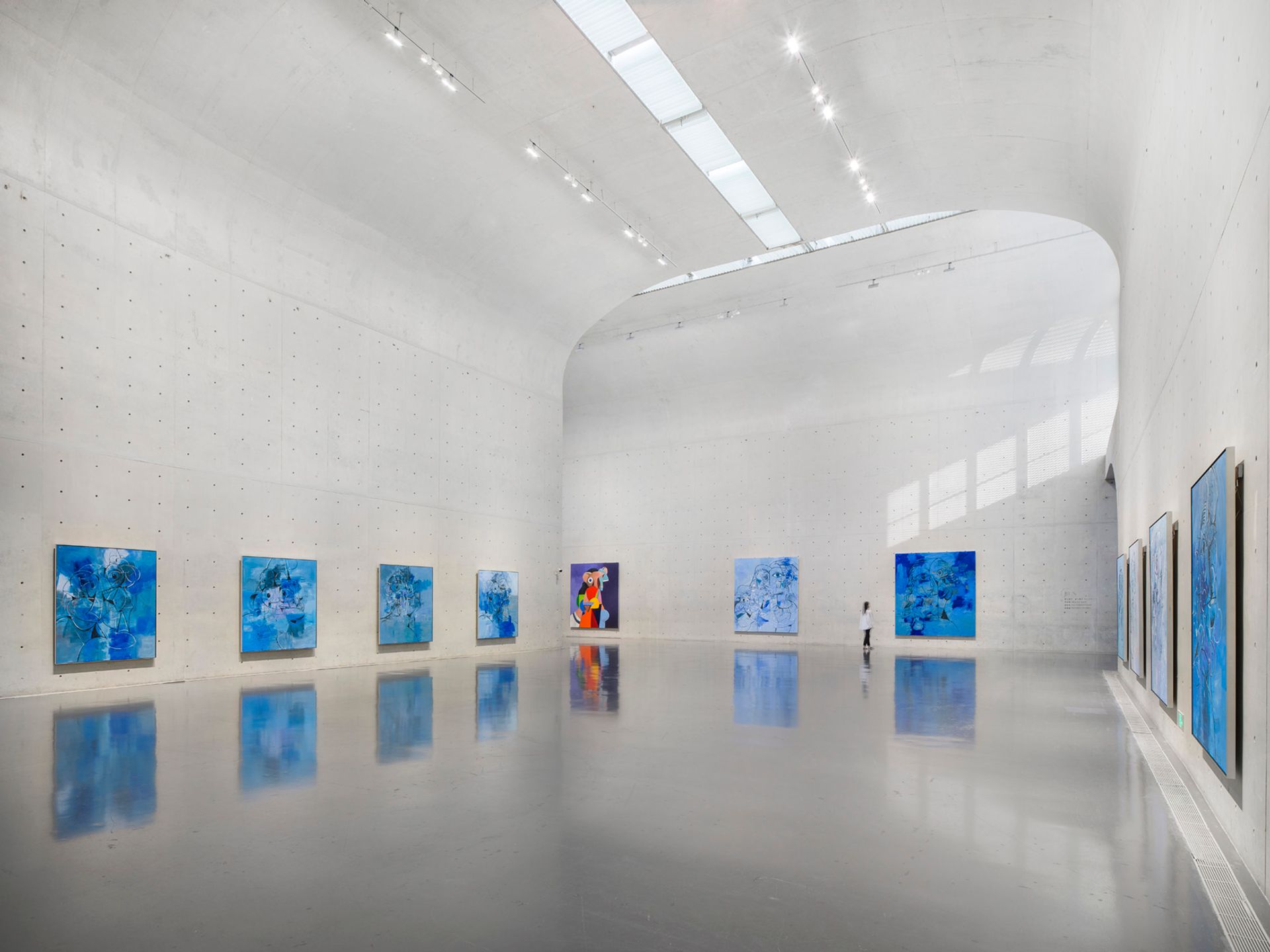
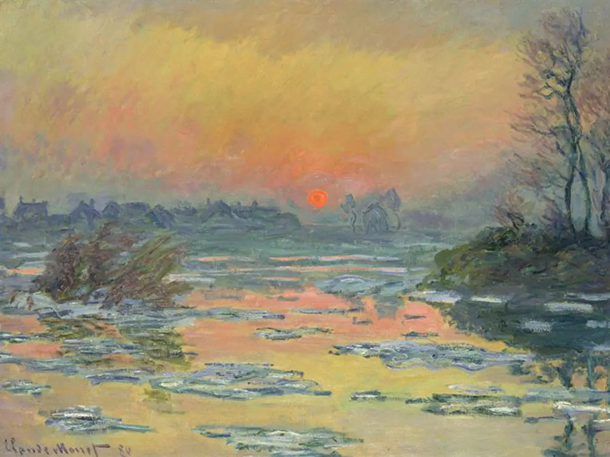
A colour scheme is a set of different colours, which are defined by their arrangement on the colour wheel. Each scheme can have different uses and different effects, and these schemes have been used by famous artists throughout history.
I’ve outlined below some of the most commonly used and popular colour schemes…
Disclaimer: Fine Art Tutorials is a reader supported site. When you make purchases through links on this site, we may earn a small commission at no extra cost to you.
How to use colour schemes effectively
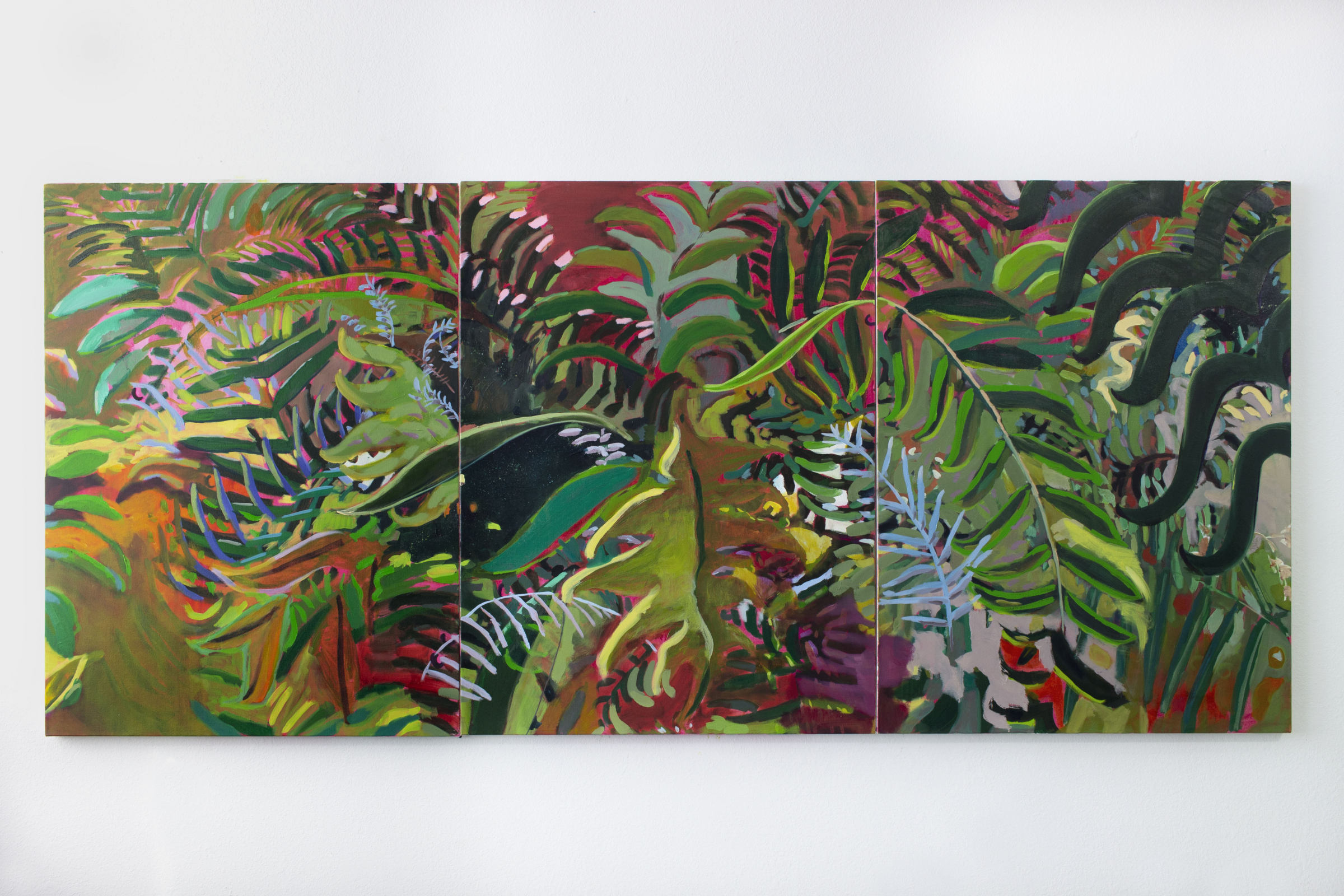
Although you will be limiting the colours you use in your painting, you don’t have to limit the tonal range. By this I mean that you can alter each colour to make areas less saturated, darken them to make shades or mix them with white to make tints.
When working with a bold colour scheme, experiment by using different amounts of each colour type. You don’t need to use each colour in equal parts. For example, if you are using a complementary colour scheme of blue and orange, by making the painting mostly shades of blue (dominant colour), then having one orange feature, you will make the orange feature more salient—it stands out because there is less of it. Play with effects like these and see what you like. Read More...