It's not beige, it's not grey: it's greige – and it's why all our houses look the same
-
 Loading...
 - Sarah Williams
- 25 May 2022
- 285 Views
- 0 Like
- 0 Comment
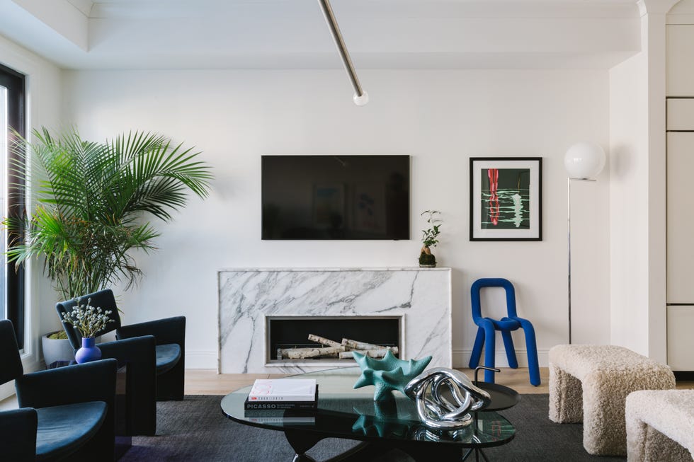
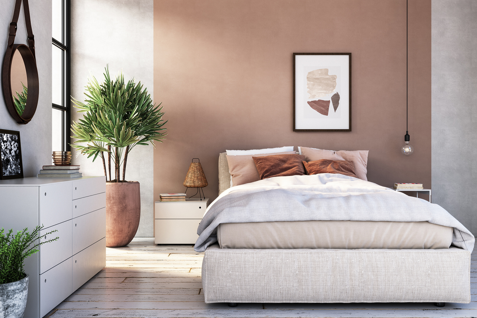
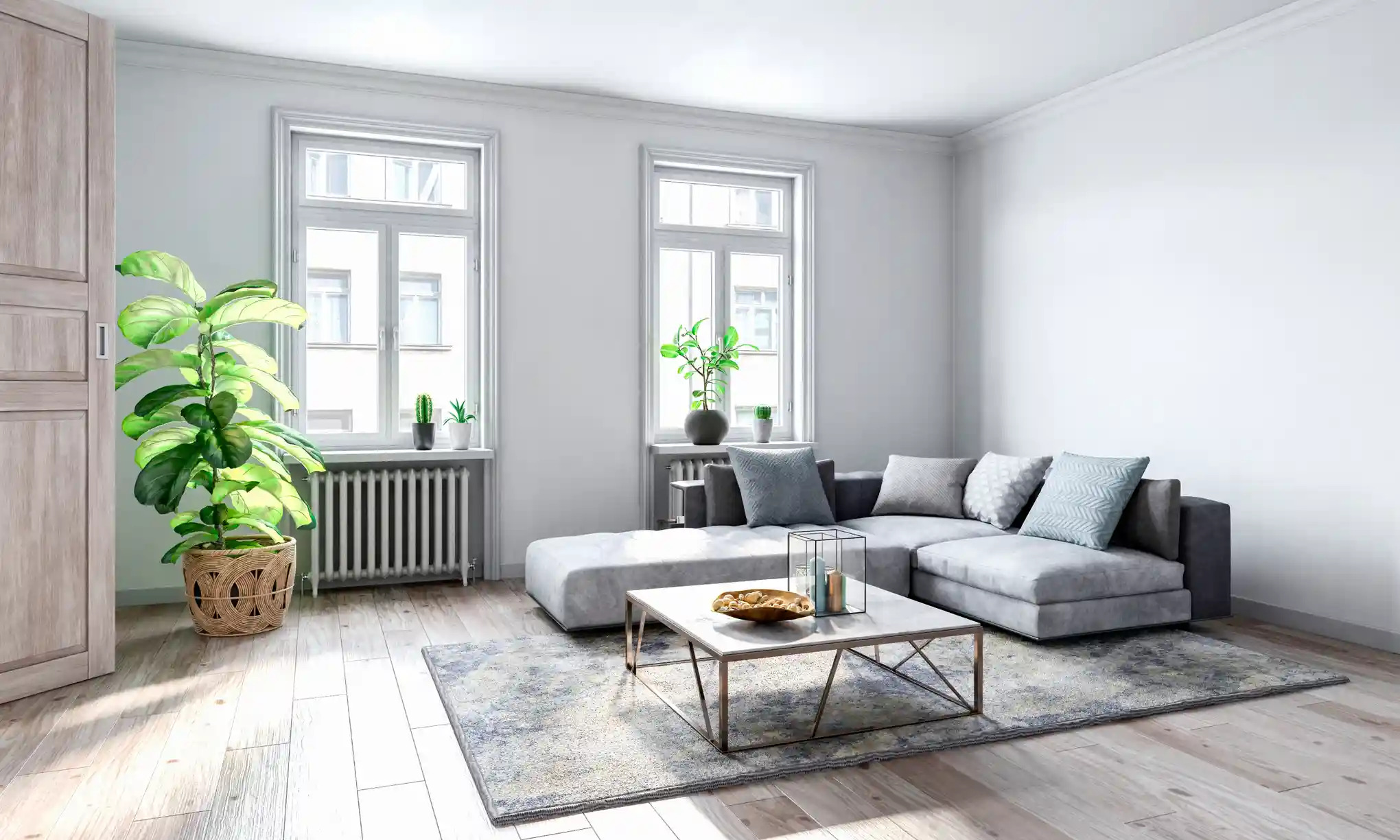
You might say it’s charcoal, silver, concrete, slate. You might call it by the name on the paint chip: Chic Shadow, Polished Pebble, Purbeck Stone. Or you might say it’s greige. Whatever you call it, the prevailing interior design trend of the past decade has been shades of grey.
Elephant’s Breath – described as an “uplifting” mid-grey, with a hint of magenta – has been called a paint color of the decade in the UK, ranking among Farrow & Ball’s top 10 shades for the past 12 years and inspiring numerous spin-offs.
In the US, Revere Pewter, an “iconic neutral”, has likewise been a consistent bestseller for Benjamin Moore since the mid-2010s. Sherwin Williams’ top 50 colours, meanwhile, span from beige to dark grey but mostly split the difference with a rich spectrum of greige.
Across houses and offices, in bedrooms and living areas, grey has emerged as the go-to neutral paint shade, and often – as real estate listings reveal – an entire aesthetic, with wall-to-wall grey surfaces and furnishings.
But these desaturated spaces in many ways contrast with the times. Over the past decade of social media, our interiors have come to be seen as an expression of who we are. Not only is society more individualistic than it was 10 years ago, it’s more polarized.
So why do we persistently reach for these drab, midrange shades? The answer is not black and white.
Indeed, says the British art historian James Fox, author of The World According to Colour, there is no such thing as a neutral color: “Only what a given society agrees is neutral,” he says. “But if you step outside that society, or look back through history, you realize that everything is ideological in some ways; everything is a stylistic choice.”
“Neutral” might be best understood as “dominant,” says Fox (whose own house in Hackney, London, is painted in Dulux’s Pebble Shore, a sandy grey “with a touch of khaki”). From the late aughts, grey began to displace bright whites and creams as the preferred palette for interiors to become, in the 2010s, as ubiquitous as “magnolia” – a buttery yellow-based white – was in the 1980s and 1990s.
But the origin of this great wave of grey goes back through centuries of western culture to a longstanding prejudice against bright colors, as explored by the artist David Batchelor in his 2000 book Chromophobia. Read More...