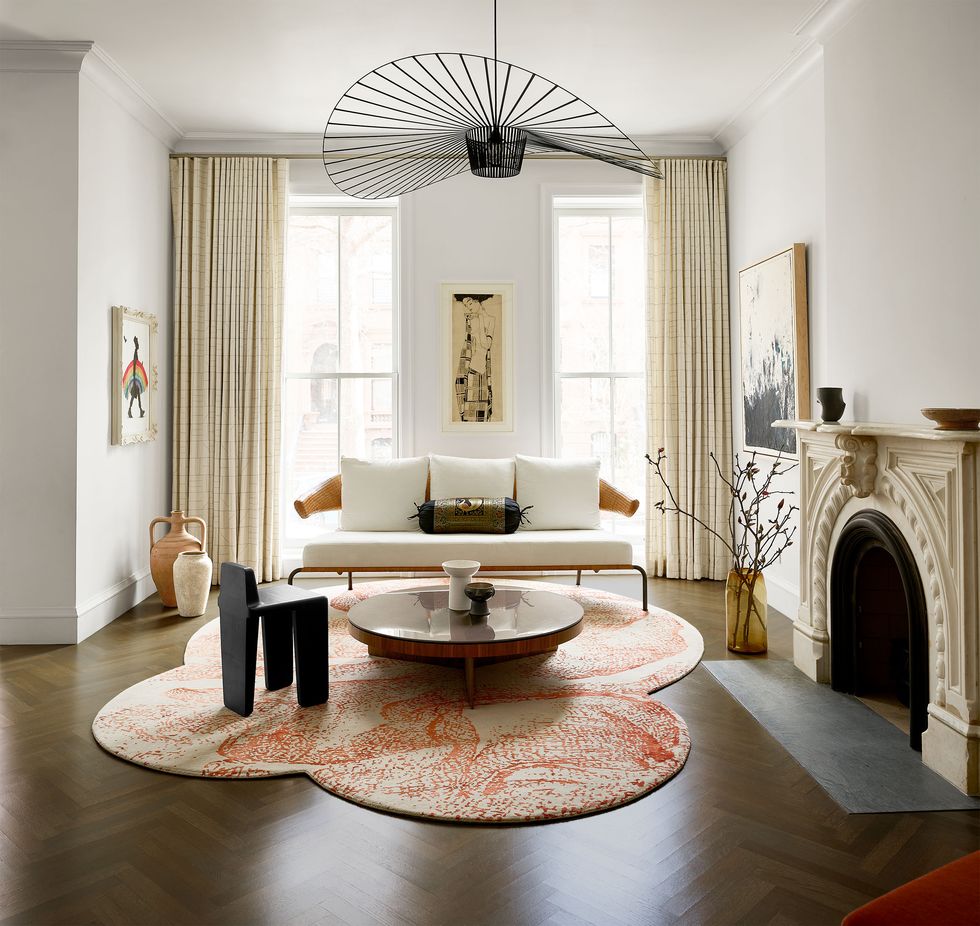
The best white paint colors, according to designers
White might be one the most popular paint shades on the color spectrum—making it a failsafe option for kitchens, bedrooms, and bathrooms—but choosing the right hue for your and your space’s needs is shockingly difficult. With so many nuances and undertones available, white isn’t just white anymore: It’s off-white, ecru, cream, ivory...must we go on? And, just like every other color, the decision gets even more challenging when you factor in finishes as well as your room’s lighting.
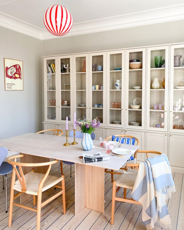
“The color—or noncolor—white offers us peace and calm in a room,” shares Patrick O’Donnell, color expert and Farrow & Ball’s brand ambassador. “The color of purity, it is the very essence of projecting a clean and ordered environment and easy to layer many other elements in a space from artwork to well-curated pieces of furniture or to bring in bolder elements such as fabric for sofas and drapes.”
So where do you even begin to choose the perfect paint color? To help, top designers share the best shades of white and where to use them. With any luck, you’ll spend less time attempting to decipher the difference between two hues that are practically indistinguishable and spend more time enjoying your space.
How to Choose the Perfect White Paint Color
Before you even begin to browse paint decks and swatch your walls, it’s important to take stock of your space’s qualities like the amount and direction of light coming into your room. “If it’s a north-facing room, a clean white will feel too chilly, so consider whites that have underlying red or yellow notes through them,” O’Donnell says. On the flip side, whites with cooler undertones will help balance out the intensity of the light in a south-facing room.
Another thing to consider? How your white in question will work with the rest of your color palette. “If using whites on your trim and moldings to go with your chosen wall color, think of a white that has underlying tonal notes of your wall color,” O’Donnell adds. “[For] a dark green such as Green Smoke, consider a slightly dirtier white with green undertones like Old White from our traditional neutrals; this will create a softer contrast than a ‘true’ white.”
Once you’ve figured out the type of white your space needs, it’s time to peruse these top, designer-approved tones.
1) Sherwin-Williams Snowbound SW 7004

For a tried-and-true neutral that has chameleon tendencies, you can’t go wrong with Snowbound by Sherwin-Williams. “It’s one of my favorite whites because it’s warm without being too yellow,” explains Amy Leferink of Interior Impressions. “It has a very clean undertone—no green, blue, or pink hues.” Though it’ll look like a true white when solo, it’ll take on a greige tone when coupled with other hues.
2) Benjamin Moore Atrium White OC-145

Looking for the perfect pigment for a kid’s space? White may not be the first color that comes to mind, but Benjamin Moore’s Atrium White is designed to appeal to the entire family. “If you want your home to feel really calm and relaxing, I suggest using a white that has a creamy tone to it,” designer Michelle Gerson says. “Benjamin Moore’s Atrium White has a little bit of a peach tone.”
3) Dunn Edwards Cool December DEW383

There’s a reason why Cool December by Dunn Edwards has been Breegan Jane’s go-to white for 10 years and counting. “[It] strikes the perfect balance and always seems to do the trick for me,” the designer shares. “Plus, it’s touch-up-friendly and works well with Magic Erasers, [which is] important for moms like myself who have active kids.” Icy and bright, this option strikes a happy medium between cool and clinical.
4) Sherwin-Williams Moderne White SW 6168

White is a foolproof option for your kitchen—and the cool undertones of Moderne White by Sherwin-Williams will look squeaky clean and pure. To keep the look from going too sterile, designers and Moderne White fans Beth Dotolo and Carolina Gentry of Pulp Design Studios recommend pairing it with bolder hues. “We like to add a little twist to our mostly white kitchens, like with a burst of orange on a barstool or a boldly patterned backsplash,” the duo explains.
5) Benjamin Moore Ivory White 925

Pair your rich, wooden finishes with Benjamin Moore’s Ivory White, a creamy white that designer Christina Kim stands behind. “Sometimes you need a creamy white, which can be tough to get right. It’s easy to veer too yellow, [which is why] I really love Benjamin Moore’s Ivory White,” she says. “This creamy white works best when you envelop the room completely and paint the trim, walls, and ceiling in it.” Read More...


