How to Photograph Artwork (8 Essential Tips)
-
 Loading...
 - Chiaki Makino
- 12 Aug 2022
- 79 Views
- 0 Like
- 0 Comment
Capturing artwork may seem simple, but it’s hard to do well. There are technical hurdles to overcome; for instance, you must achieve an even exposure, avoid reflections, focus accurately, and choose the perfect aperture to keep the art sharp.
I love to document artwork. And in this article, I share the tips and tricks I’ve learned over the years, which cover lighting, settings, gear choice, and more.
Note that the techniques I give are geared toward two-dimensional art: paintings, drawings, and prints. But many of the tips I offer also apply to three-dimensional art – so if you’re hoping to capture installations and/or sculptures, I’d still encourage you to keep reading!

1. Carefully adjust the white balance
When photographing artwork, white balance is not objective – there’s a creative decision that must be made. Do you want to preserve the color of the art as you see it? Or should you neutralize any color casts and make the whites white? Will you be a historian? Or will you be a restorer?

Paper and paint tend to discolor with age. You have to decide if you want to copy what you see or turn back the clock – assuming you’re correct in your assumptions about the original color.
To correct the white balance on a piece of art, you have two main options:
00001. If you want to make the whites appear white, take the photo using your camera’s Auto White Balance setting, then open the image in a photo-editing program. Choose an area within the artwork that should be neutral in tone – preferably a mid-gray spot. Click on this area with a white balance tool to equalize the RGB values and correct color throughout the piece. Problems arise when the artwork has aged more in some places than others, and you may end up with ugly yellow blotches in certain areas.
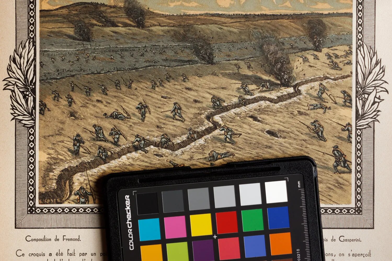
00002. If you want to preserve signs of aging, take a shot using a gray card, then use it to set the white balance when processing the file. It’ll keep the existing color of the artwork, including signs of aging. And if you want to emphasize an antique look, you can always warm the photo up a bit.

A third option – if you have no neutral tones in the image and you didn’t use a gray card – is to fiddle with the color temperature and tint sliders until you think the white balance is correct. Correcting color by eye is hit and miss, however, and it’s never as accurate as the options discussed above.

By the way, the light source will dramatically affect the white balancing process. Avoid mixed lighting if you can! In museums, you won’t often find paintings under mixed light sources, but the same is not true of sculptures. A mixture of warm artificial light and window light can cause strong orange or blue color casts in parts of the final image, which can be hard to deal with in post-processing: Read More…