11 Colors that pair perfectly with purple
-
 Loading...
 - Adriana Melo
- 20 Jul 2022
- 113 Views
- 0 Like
- 0 Comment
Though purple might be associated with enduring opulence and royalty, it rarely takes center stage in our spaces. Primary hues like red and blue are often considered power pigments, due to their versatility. Finding colors that match purple—these colors’ plummy offspring—is a trickier proposition. Thanks to a mix of old-school inspiration and forward-thinking design, however, homeowners are ready to look at their quarters through lilac-colored glasses.
Joanne Thomas, head of content of Coloro, shares that purple—from soft lavenders that mimic our devices’ ultraviolet rays to saturated shades that hark back to the ’80s—honors exactly what so many of us have held close since March 2020: the unwavering power of technology and a longing for yesteryear. “Purple is having such a moment as we really saw the sensorial shade reintroduced from our ever merging worlds of IRL and URL,” explains Thomas, who recently teamed up with the agency WGSN to create a digital trend forecasting experience called A Window to the Future of Color.
But despite being the color-equivalent to a modern-day security blanket, purple has the reputation of being a tricky color to decorate with. Purple demands attention, creating the impression that it does not play nicely with others. But in reality? Purple offers ample versatility—you just need to know how to use it. “Consider the mood of your room and the impact you want to create,” Thomas advises. “Deeper, darker purples can allude to a feeling of opulence and would be a perfect fit for secluded and cozy—especially with teals, deep browns, and forest greens.”
To show its full potential, 10 top designers are sharing the best colors to pair with purple. From pared-back duos to eye-catching combinations, one thing’s for sure: Purple deserves to be front and center of your next room makeover.
1
PAIR YOUR PURPLES

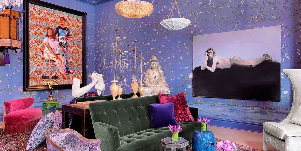
“Lilac is a great color to mix with purple. It’s in the same family, but a lighter pastel,” explains designer Linda Hayslett of LH.Designs. “Pairing this with a medium to dark purple tone makes both colors complement but contrast each other at the same time. I recently paired a purple primary-bedroom paint color with a pretty wallpaper that had lilac in the print. It really made the mood for the space read sophisticated and mature.” Want proof? Look no further than this Upper East Side apartment, designed by Alex Papachristidis, where purple tones rule the roost.
2
GO FOR THE GOLD

“When using purple, I love pairing it with brass finishes,” Hayslett adds. “The gold tones that come through can really pop off of purple and make it look luxe and glam. Depending on the brass used, you can even mix and match the different brass with lighting, hardware, and accessories. You can’t go wrong, as it’ll elevate the look of the space. The lighting, hardware, and accessories stand out but complement one another, making the space feel like a high-end hotel.” It’s clearly a winning strategy, this time seen in designer Alex Papachristidis’s own apartment.
3
GO CLASSIC WITH BLACK AND WHITE

“I prefer purples that are deeply saturated and warmer in tone,” says Tara McCauley. “Purple looks especially luxurious in a glossy finish, and you can’t go wrong pairing it with black and white. I love the graphic contrast of black and white to a color so evocative of flowers and fruits.” Here, in a small apartment, the designers at Cochineal contrasted bold burgundy cabinets with graphic slabs of black and white marble.
4
STAY COOL WITH BLUE

“Purple is my favorite color,” says Rozit Arditi, owner and principal of Arditi Design. “It can be as subtle or as bold a statement as you make it to be. It’s all about how it is used and what it is paired with. Lilac can be paired with lighter blues and whites to create a more soothing, light, and airy feel.” Celebrated textile designer Lisa Corti worked with the natural light in her colorful apartment to create this cheery, lilac-tinted kitchen.
5
GET GORGEOUS WITH GRAY

“Purple is my absolute favorite color, especially when it hues with a true blue undertone and casts less berry toned,” designer Kendall Wilkinson shares. “It is passionate, strong, and regal. Purple and the family of colors from aubergine to lavender all work beautifully with gray, and the pairing keeps the purple cool in tone and serves as a perfect complement.” Indeed, purple works as a neutral in this home designed by Rodney Lawrence, thanks to silvery and gray tones. Read More...