Google’s account switcher shows off a new Material You look
-
 Loading...
 - Claire Lavigne
- 25 Jan 2023
- 64 Views
- 0 Like
- 0 Comment
The web interface’s sharp rectangles looked so out-of-character, anyway
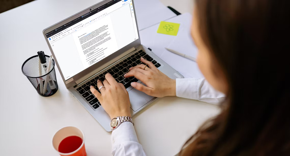
After Google introduced Material You to the world with Android 12, it started pouring efforts into making its essential Android apps like Messages adapt to the new design guidelines. Next in line appears to be the desktop web versions of these services, as Google is finally giving most of its popular sites a taste of Material You, with changes showing up in the account switcher now.
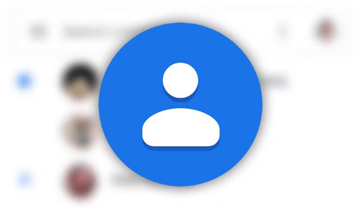
Google sites have a button in the top-right corner for switching and managing accounts — this helps keep things like your personal account’s Search history from permeating into suggestions for work-related queries.
This account switcher interface has transitioned from a sharp, boxy design to a neat, nested rectangle layout with heavily rounded corners, 9to5Google reports. The changes appear to have gone live for a majority of Google products — so far, we’ve spotted them in Search, Maps, Calendar, Photos, Drive, and Docs, to name a few. Read More…