Histograms in Photography: A Guide
-
 Loading...
 - Luiz Gomes
- 19 Jul 2022
- 106 Views
- 0 Like
- 0 Comment
If you didn’t believe your grade school math teachers when they said you’d use graphs in the real world, you’re about to. In photography, histograms can seem intimidating, but they are incredibly useful tools that are much easier to understand than they appear. Learning about histograms will help you understand exposure, post-processing, and the overall structure of a photograph.
This guide will provide a detailed explanation of histograms in photography, how to use them in the field, how histograms help with post-processing, and other useful tips on how to use histograms to your advantage.
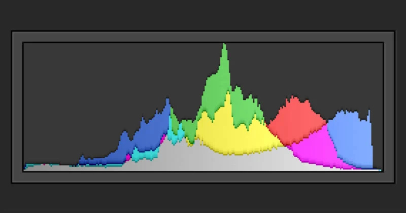
What is a Histogram?
In photography, a histogram is a graph that is used to help gauge exposure. Each histogram is a graph of tones and their frequencies. The “X” (horizontal) axis represents tones, going from black on the left side to white on the right side. The center of the axis represents the midtones of an image, with the shadows to the left of the midtones and highlights to the right.
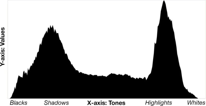
Tip: If you have trouble remembering which values are on which side of the histogram, just remember that “light” rhymes with “right,” and this should help you recall that the light values (highlights and whites) are on the right side of the graph.
The “Y” (vertical) axis represents the frequency of each respective tone. A high frequency of a certain tone is represented by a high value (a peak in the graph), while a low frequency is represented by a low value (a valley, or no value).
In very simple terms, a histogram is a graph showing how many pixels of each brightness value is found in a photo.
The bright parts of the image are displayed on the right side, darks are on the left, and midtones are in the middle. Each tone’s frequency is plotted, which will help you determine if an image has too many bright or dark values. Read More...