Maple leaf to the moon: Canadian Space Agency debuts new logo
-
 Loading...
 - Allen Anderson
- 20 Mar 2023
- 60 Views
- 0 Like
- 0 Comment
It symbolizes 'daring invention and our sights set on the future, ready to push the boundaries of ingenuity and innovation.'
When the first Canadian astronaut to launch to the moon lifts off with NASA's next Artemis mission, he or she will do so wearing a new symbol of Canada's efforts in space.
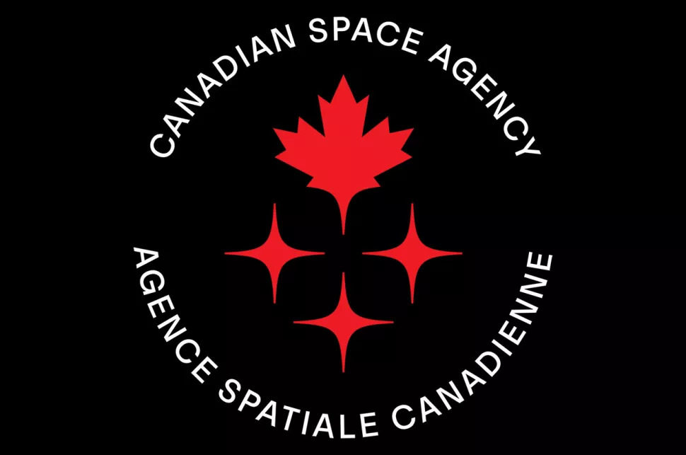
The Canadian Space Agency (CSA) on Thursday (March 16) debuted a new logo to represent the growing role of the country's space program.
"An exciting era of space exploration is unfolding before us, and the CSA seeks to enter this new chapter with a modern identifying symbol," read a statement from the agency. "The Canadian Space Agency is modernizing its visual identity with a new simplified logo."
The new mark features two main elements.
At top is the maple leaf, Canada's national emblem. According to CSA, the leaf "generates pride and a sense of belonging," in addition to its association with the country, as is known all around the world.
The maple leaf also gives the impression of taking flight.
It symbolizes "daring invention and our sights set on the future, ready to push the boundaries of ingenuity and innovation," CSA's description read.
Trailing the maple leaf are three stars, which at its most basic interpretation are a representation of space. The stars are also meant to convey brilliance, intelligence and expertise, as well as the strength of the community, which includes all those involved in Canada's space program, including industry, scientists, academia and STEM (science, technology, engineering and mathematics) organizations. Read More…