Complementary Colors in Photography
-
 Loading...
 - Rayna Dimitrova
- 28 Sep 2022
- 73 Views
- 0 Like
- 0 Comment
Photography, as the name suggests, is the process of creating images with light. But if you use only light, the entire image will be pure white (or any other color). So we also need the absence of light, or shadows, to create and showcase what we want. It’s the interplay between light and shadows that creates the final image.
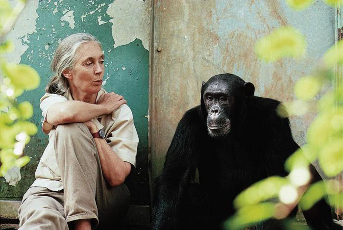
Similarly, composition alone does not make a good photo great. The colors and sometimes the absence of it (for black and white images) along with the composition complete the final image.
The colors in a photograph are the first thing that catches the viewer’s attention, and they can make or break the image. If you go shooting outside on a dull day and there is not much color going on, it could even be a good idea to convert the picture into black and white or monochrome so that the viewer focuses more on the composition and doesn’t get distracted by the dull lack of colors.
Color theory is therefore important to learn alongside composition. It works for any and all types of images, be it portraits, landscapes, or any other category. One of the most widely used color schemes by photographers is the complementary color scheme.
In this article, we will explore what complementary colors are and how you as a photographer can use the concept to capture compelling color photos that grab your viewers’ attention.
Table of Contents
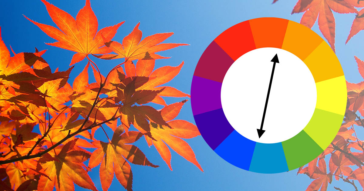
An Introduction to the Color Wheel
Color Harmonies and Schemes
The Power of Complementary Colors
Examples of Complementary Colors in Photos
Shooting Photos with Complementary Colors
An Introduction to the Color Wheel
Color theory in essence is the interaction of various colors, and this interaction is often represented by what is known as the color wheel. Read More...